Over the past four months, we have been working very hard on a secret project that, as of right now, isn’t so secret anymore. Today we’re unveiling our new logo.
At Cavera, we’re always looking at ways to make things better. We’re constantly asking questions like:
- How can we streamline our workflow?
- What would make this [website, interface, tool] easier to use and understand?
- What can we do to engage people more effectively?
Finding the answers to these questions helps everyone. It helps us, it helps our clients, and it helps the end user. The answers are often discovered through new technologies, new ideas, and sometimes, through new directions.
Today we’re proud to announce the launch of a new direction: a brand new logo.
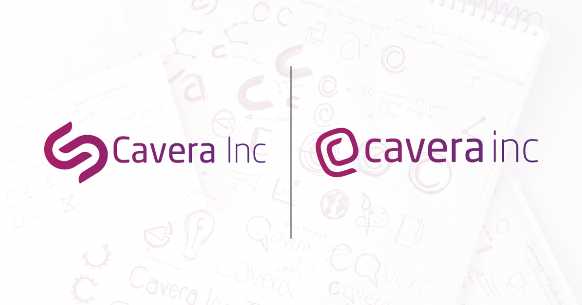
![]()
Cavera Inc. started in 2011 as a small business operated from the home of a young, driven entrepreneur, and since then we’ve grown and matured into a digital agency that’s actively challenging the norms in Sault Ste. Marie and surrounding areas. Our team is now made up of three full-time professionals—feel free to read more on our About page.
Though we only started the logo design process four months ago, we’ve been working on rebranding Cavera for quite a while now.
Cavera is not the same small business that it was in 2011. Cavera’s evolution as a company has been steady and we strongly believe that brands are not separate from their companies; they must evolve alongside them. Over the past year, we have been streamlining our services, our message, our process, our workflow, and our visuals to be more consistent and intentional.
These core changes have made us realize that if we want to keep pushing forward, we should consider a new logo. Not that our previous logo is bad—it just isn’t “us” anymore. Additionally, we found that there are a lot of logos out there that look like our old one. We decided that it was in our best interest to be intentional in creating something that accurately represents us.
A little about our new logo.

Our goal was to position Cavera Inc as the professional, creative, and uniquely digital powerhouse that it is. With that in mind, we brainstormed, sketched, and explored all of our options.
The end result was too many Illustrator artboards to count, followed by a lot of humming and hawing, and then some time to digest our options.

We all agreed on the logo you see before you today. The new Cavera logo has a few simple ideas behind it:
- It’s a letter C.
- It’s styled to look like an @ symbol. Why? Because of its ubiquitous relationship with all things digital: email addresses, twitter/social usernames, and programming languages.
- As our developer James pointed out, it looks like a paperclip. Hey, why not? We’re organized.
Over the next few months, we’ll be rolling out the logo across all mediums—social media, websites, software, signage, stationery, etc. The entire logo is more cohesive and clean than the previous one. It takes that uniquely digital stance we were aiming for. Overall, we’re ecstatic about our new direction and find it exciting to finally share it with you.
Questions about the new logo? About our process? About anything at all? Get in contact with us; we’d love to talk.